CASE STUDY
Design a responsive web-app for finding an expert

ABOUT
Users need a way to reliably connect with a medical professional because they require advice for their health care needs.
They will engage with an app that is simple, seamless to use and gives them flexibility to connect with an expert that suits their schedule. The app will give users info about who they are connecting to so they feel confident that the person is knowledgeable in their field.
DESIGN CHALLENGES
Built from the ground up, all aspects of the design needed to be considered including the visuals, information and structure.
PROJECT
Apollo Health* - Portfolio Project
METHODOLOGY & SKILLS
Competitive Research
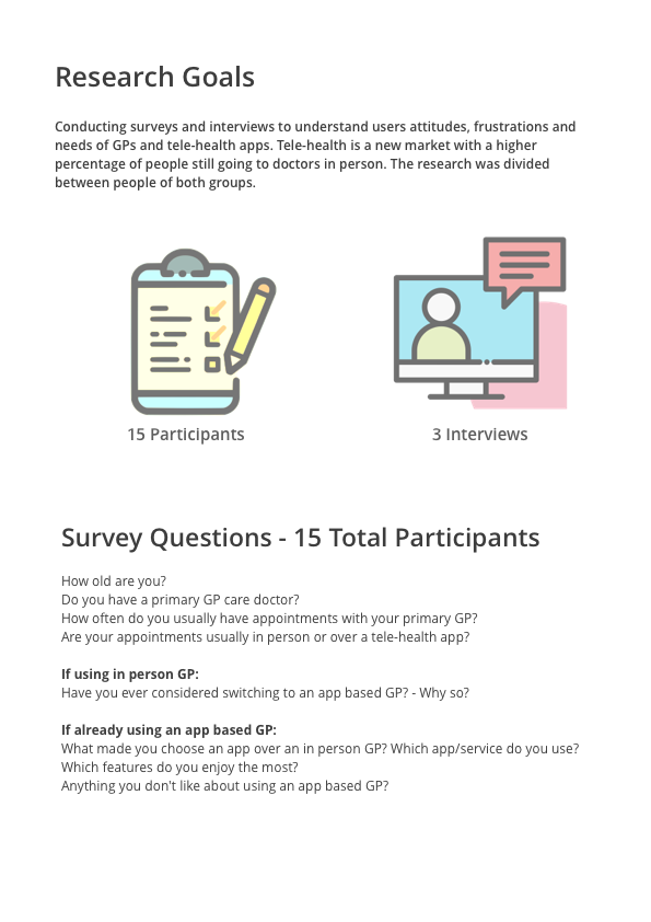
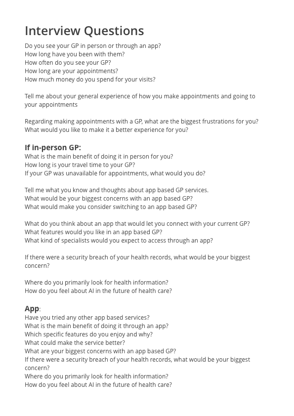
User Research - Surveys & Interviews
Site maps
Mental Models & Flows
Information Architecture
Usability Heuristics
Wireframes & Protoyping
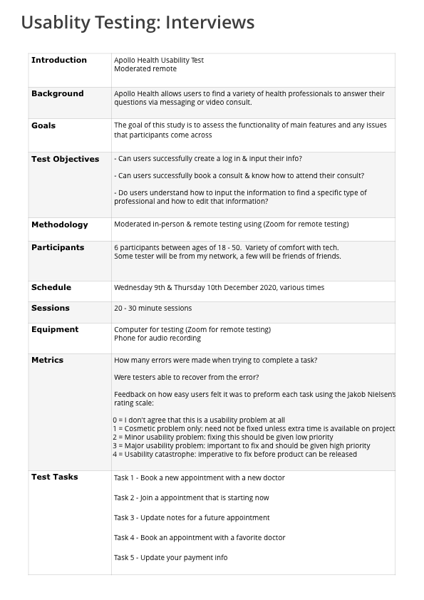
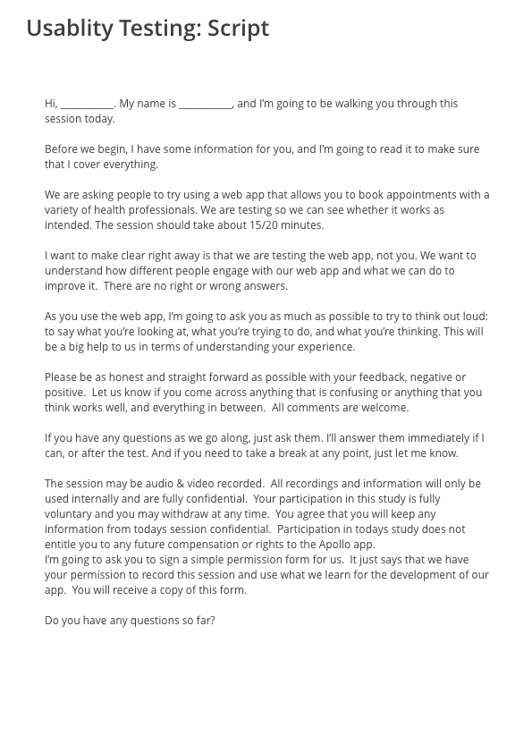
Usability Testing
Preference Testing
Visual Design
TOOLS
Sketch, Photoshop, InVision, UsablityHub, Optimal Sort
TIME FRAME
6 Months
Understanding: The Competition
Teladoc
4.7 Play store / 4.8 App store
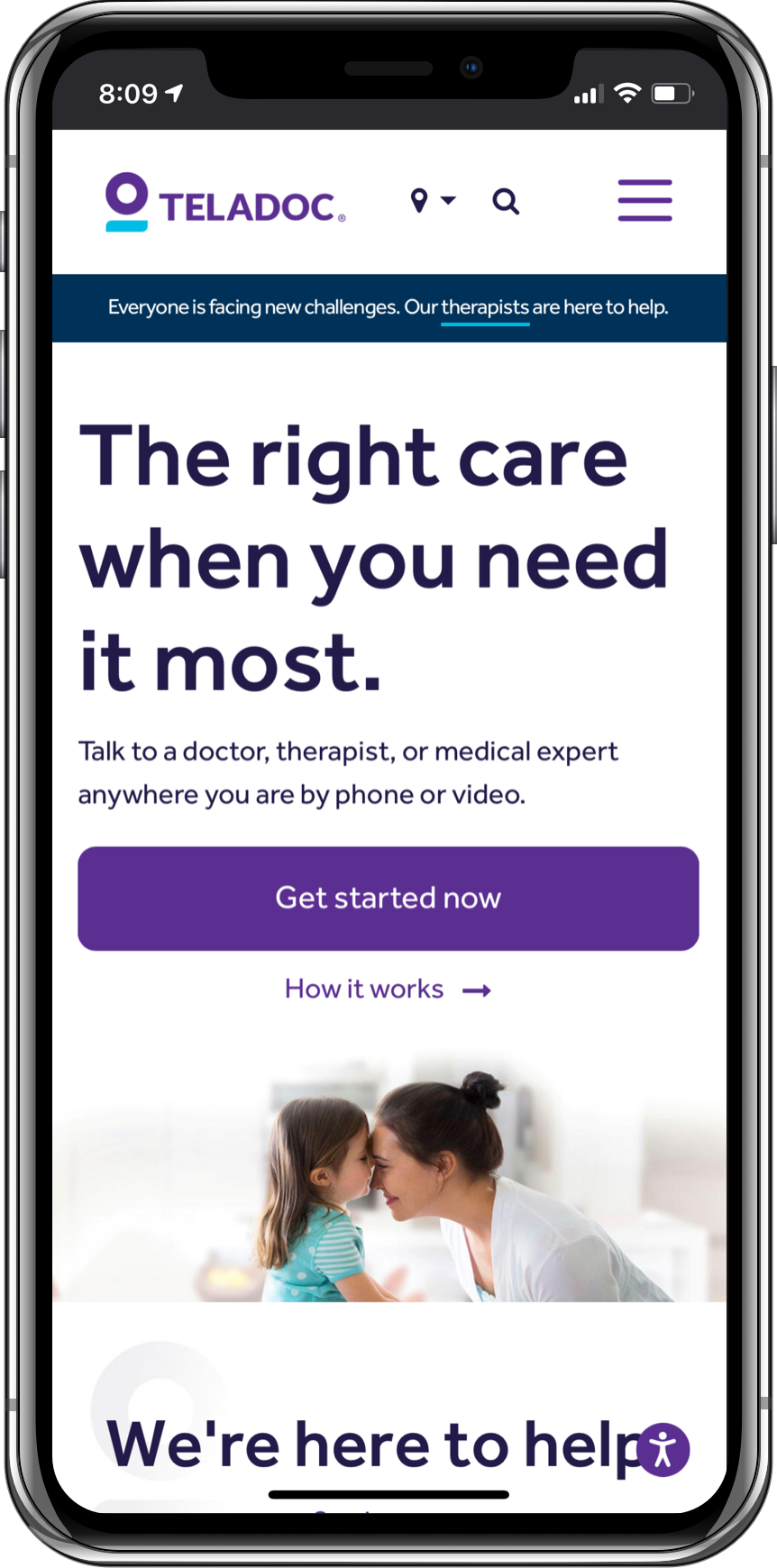

"The right care when you need it most"
Babylon Health
4.6 Play store / 4.8 App store
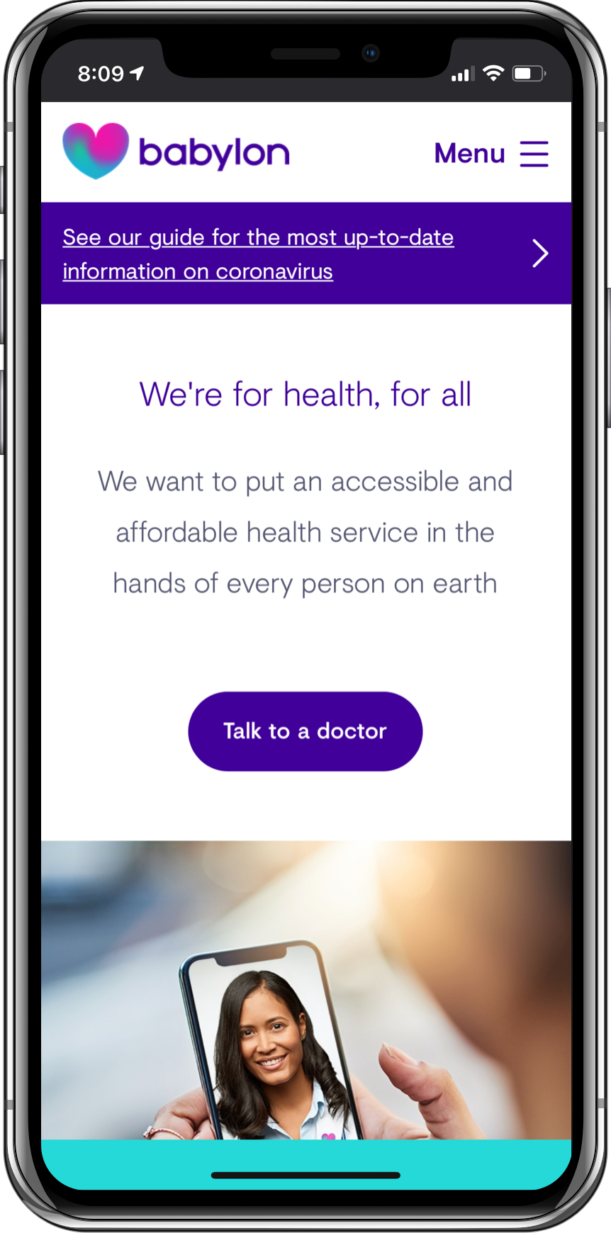
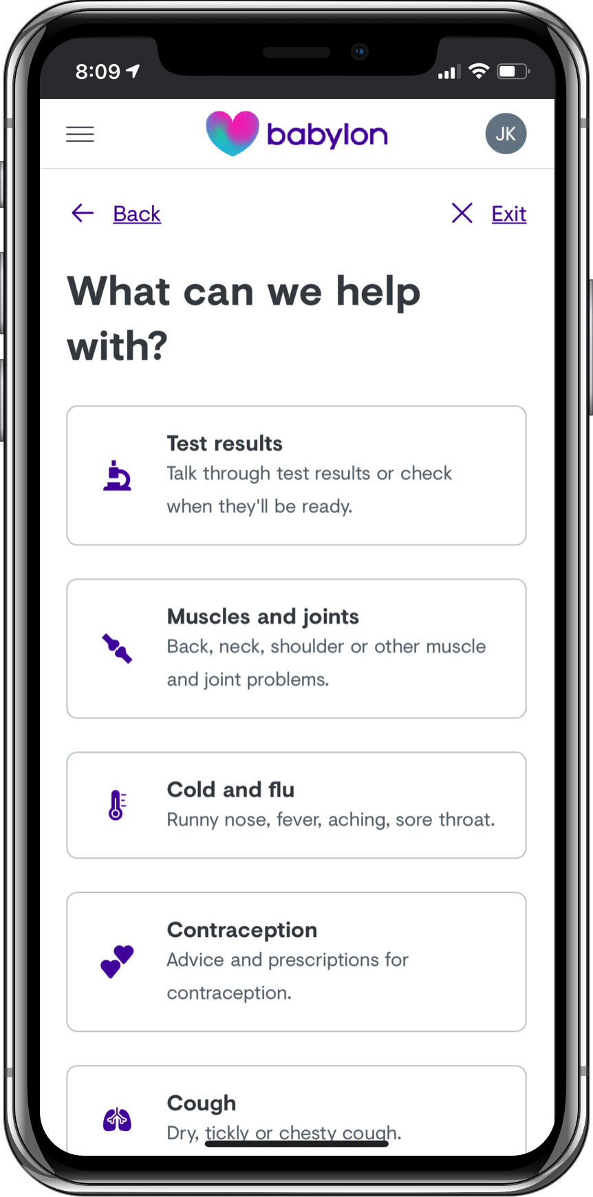
“Babylon's mission is to put an accessible and affordable health service in the hands of every person on earth.”
Identifying Potential Issues
- Users cannot find the type of expert they are looking for
- An expert is not available within the timeframe needed
- There are not enough experts available to meet demand
- Users not being satisfied with the information they received from expert
- Users feel overwhelmed by the amount of experts and don't know which to pick
- The expert is not knowledgeable in a way that can help the user
- The wrong pharmacy was chosen
- There is software/hardware failure and the video/call cuts out

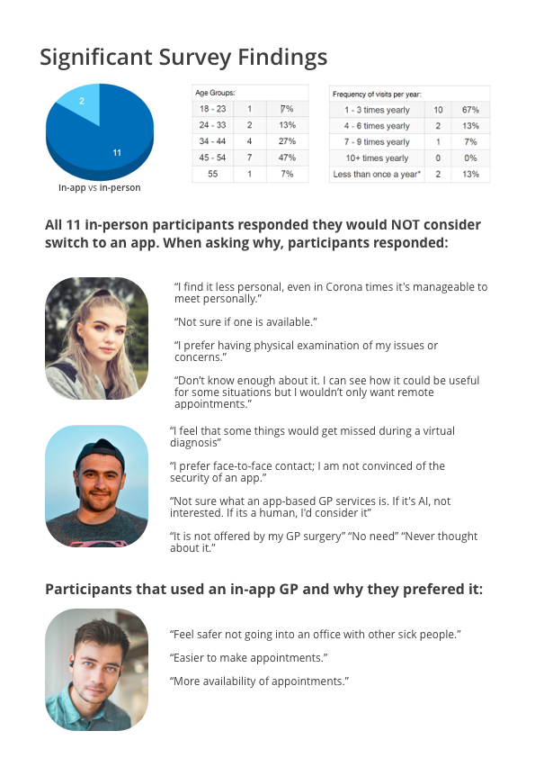
Understanding: The User
Identifying who the relevant customers are and prioritizing their goals, needs and motivations. This guides to design with a users-first mindset rather than feature-first.
Research through surveying and interviews provide data to understand who the primary users are and what their needs are.
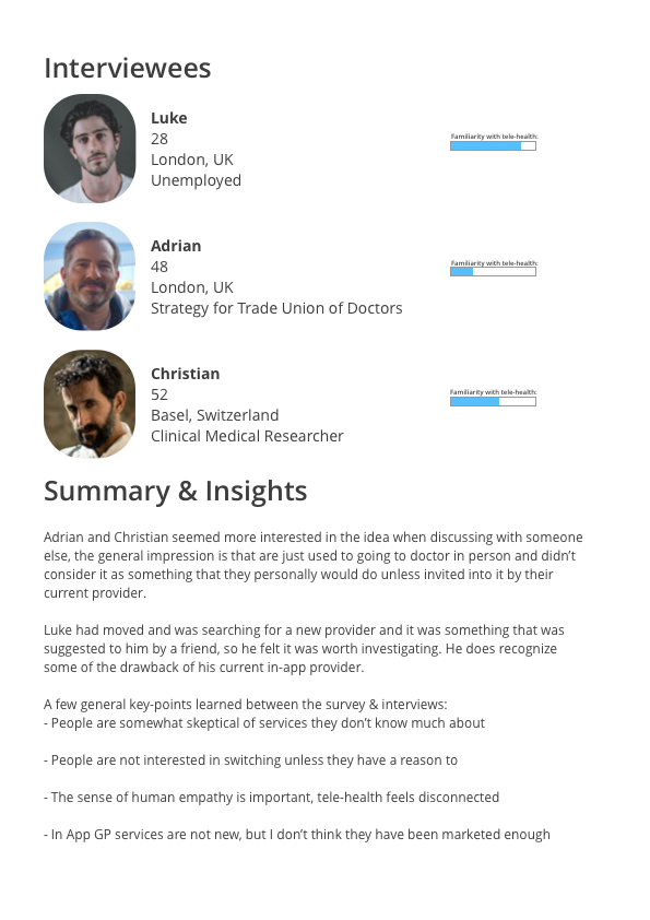
Using research info, personas and stories are built to guide the design process.


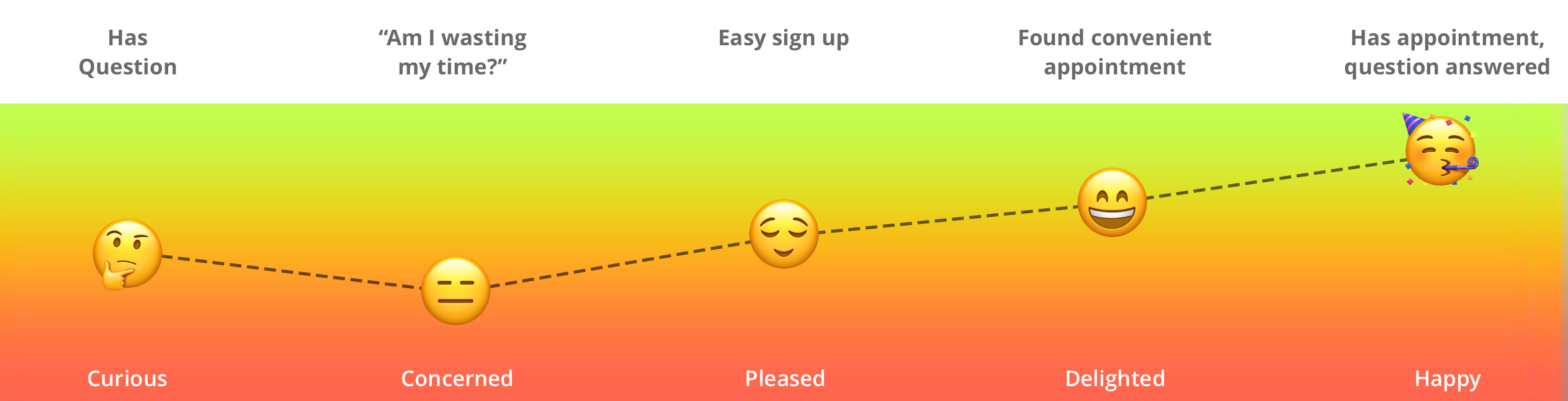
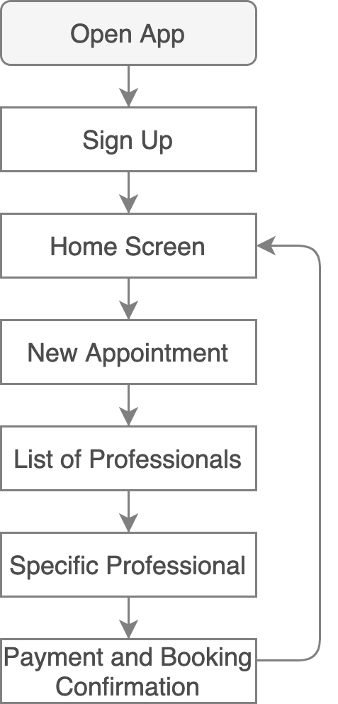
Understanding: Mental Models & Journey
Users expect to be able to sign up easily, book an appointment within a few screens and have a consult at a specified time. They want to know where they are in the process and be able to input/select their preferred payment type. Before designing, I mapped a hypothetical experience.


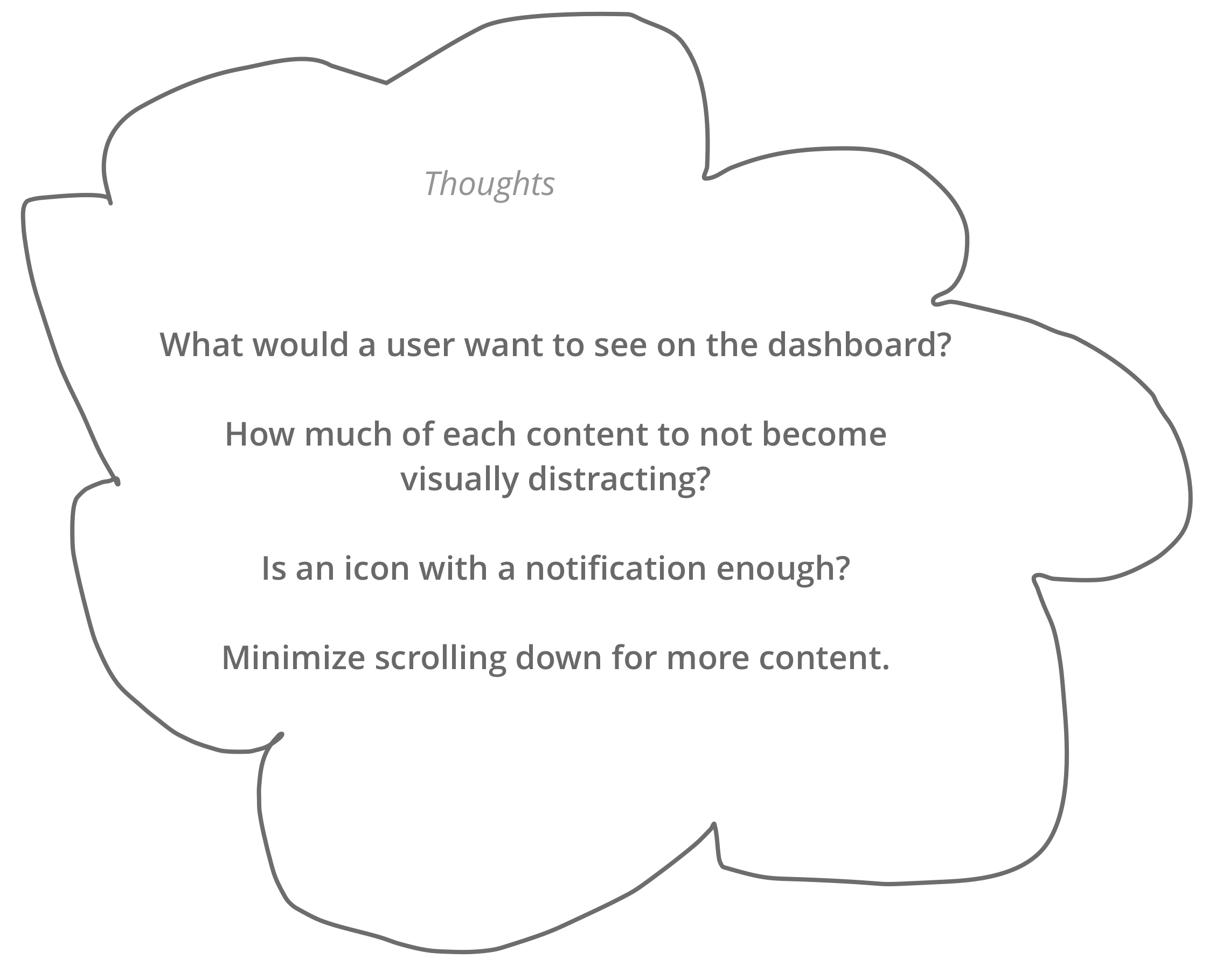
Ideate
If it were magic, how would it work?
Bringing together ideas design for the user. Keeping true to Jakob's law, using familiar and recognizable patterns to define potential solutions.

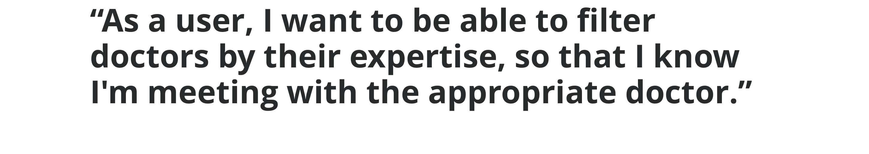
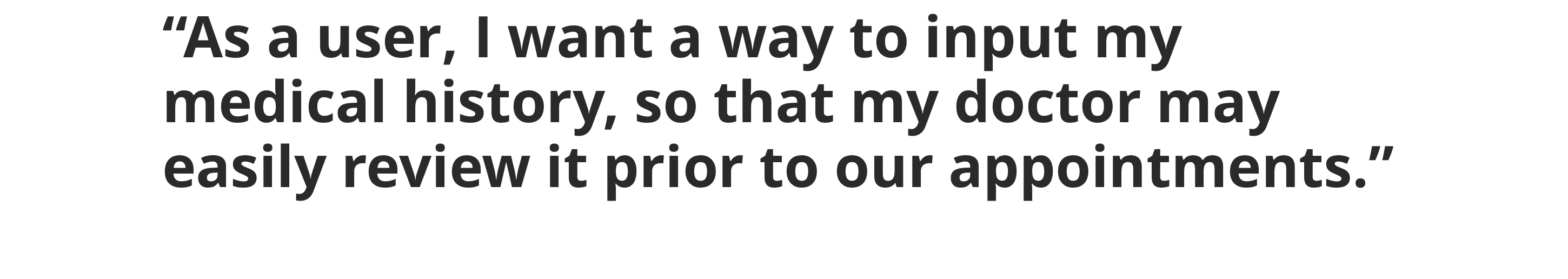
Requirements for MVP:
- Be able to book a new appointment (time/date)
- Be able to choose from a variety of clinicians and read about them
- Be able to tell a clinician what is concerning prior to appointment
- A way to have consult (messaging/phone/video)
- To be able to modify and cancel appointments
- A way to save favorite clinicians and book with them again
- A way to pay through app
- Input and update personal information
Additional features:
- Lifestyle content, health news, articles and other related content
Considerations of future when designing:
- Additional types of clinicians can be added, including in-office treatment
- Messaging can be used for a free/low fee pre-consult before booking an appointment with them directly (eg. speaking to a dermatologist to show examples before treatment in office)
- App to become an "all in one" (fitness tracking, food tracking, mood tracking) - use data to provide better health information


Prototype & Testing


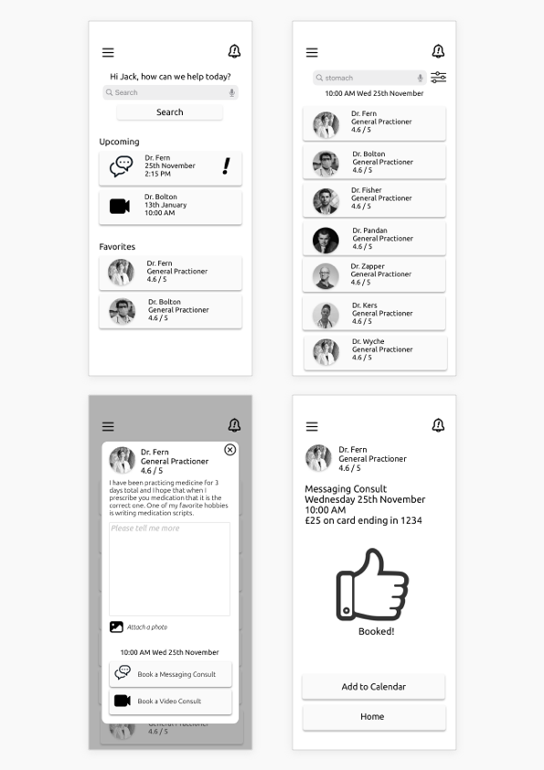

Sorting & Reviewing the Findings
Categorizing the feedback from 6 testers into two charts; 1-show overall comments, 2-specific to features. This information is used to validate, improve the design & prioritize focus.


Error Ranking
0 = I don't agree that this is a usability problem at all
1 = Cosmetic problem only: need not be fixed unless extra time is available on project
2 = Minor usability problem: fixing this should be given low priority
3 = Major usability problem: important to fix and should be given high priority
4 = Usability catastrophe: imperative to fix before product can be released
Suggested Solutions
Search for booking - The original idea was that users can search a symptom or concern and the results would guide them to booking the appropriate type of clinician.
Testers, however, were very confused by using search to start a new booking. New proposal is to provide a drop down menu with common issues, and an Other option.

Joining the appointment - Testers were unaware that Upcoming was not just notifications, but buttons as well. Language was added as well as navigational arrow.
Information about what appointment is about was added.

Calendar - Some testers wanted to book new appointments from the calendar: section has been added.
More information was added to individual cards instead of having to open. Cards can collapse as well.
A search/filter function was added.

Filtering & Booking - Testers felt that the function could be streamlined to be more responsive.

Language Updates:
Favorites is now Your Favorites
Explanations on the clinicians in the search area
Upcoming clarifies what type of consult
"Join Now" wording has been added
Language that clarifies user is rating session with doctor, not how well app performed (eg. video quality)
Card Payments: Edit has been changed to Update
Visual Language
At the current stage of Apollo Health, MVP, it is best to keep visual content simple, familiar to the user and focused on content/information with the use of Apple's Human Interface Guidelines. This will future-proof further development of the app.
The blue and white theme was chosen as it is a common color scheme for healthcare environments. It promotes a clean and calm feel, while reinforcing the sense of trust (1). A survey was run to find the shades of blue most associated with the feelings of healthcare and healing.
1- Bosch, S., Edelstein, E., Cama, R., Malkin, J. (2012, October) The Application of Color in Healthcare Settings. Architecture & Design Scotland
Color Guide

Buttons & Fields

Type Size - SF Pro

Iconography - SF Symbols
Responsive Design

Elements will easily expand depending how the user is viewing the app. The phone version needs to keep information compact to fit on the smaller screen and not to visually overwhelm the user. The focus is always on their appointments.
The computer and tablet version will allow for larger cards that can be expanded to show/hide additional appointment information. More imagery can be incorporated into the dashboard for a more visually varied experience. The additional columns allow for a user to view individual sections more easily.
(The booking feature is shown on the tablet/computer fully,
but content would load as needed for a simpler experience.)
Designing for Accessibility

All people need equal access to health care and it is important that we design for those users as well.
Suggested Additions
A high-contrast version of the app would allow for easier use for someone that is visually impaired.
The additional borders would help show which elements are cards and clickable.
Text has been enlarged with greater spacing and made black for greater contrast.
#0029FF is suggested as a safe color with a 7.61 (AAA) ratio to the background.
Forms get additional labels, as well as example placeholder text.
Ideas for Future Development


In the future, Apollo Health will partner with a greater number of clinical and lifestyle providers. The aim is to integrate all data from healthcare and lifestyle apps. This will provide users with a rounded, holistic view of their health.
*Apollo Health is an example project and is not affiliated or connected with any product
Thanks for reading!
Jack Kuzniar © 2021